4 aging Windows 10 user interfaces that need to be updated (now)
Windows 10 is full of old user interfaces that really need updates. Here are four of them that stand out.


Most of us are probably aware of Windows' big problem when it comes to design consistency ... it doesn't have any. That's mostly due to the fact that Windows 10 is built on decades of old code. While Microsoft is trying its best, there are still plenty of areas in Windows 10 that throw you back to UIs that were first introduced years ago.
Here I'm pointing out four obvious old UIs that are still present in Windows 10 today. This list isn't limited to "legacy" UIs, like those first introduced in Windows 95. Everything up to Windows 8 is considered old UI in Windows 10, now that Fluent Design is a reality.
Music control

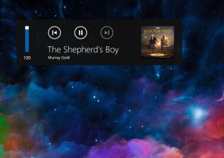
The current music control UI found in Windows 10 was first introduced with Windows 8 in 2012 and is using Microsoft's Metro design language. While Microsoft's current design language is a spiritual successor to Metro, a lot has changed since the Windows 8 days, making the current music control element seem somewhat out of place.
It's not using any Fluent Design effects, and its iconography screams Windows Phone 8. Give it some blur, change up the icons, give it a dark and light mode, and perhaps even make it a little denser for mouse users, and you've got an updated music control that follows along with Windows 10's design.
USB popup
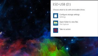
Upon inserting expandable storage on your PC, a popup will appear asking the user to choose what they want to do with the device they've just plugged in. This is yet another UI that was first introduced in the Windows 8 days, and it hasn't been updated nearly enough to follow along with today's design language.
In fact, the dialog itself still appears at the top right of the screen, even though toast notifications have moved to the bottom right on Windows 10. As a bonus, it'd also be great to see Microsoft update the scan and fix UI, something that hasn't changed in Windows since Vista.
Windows 10 clean install UI

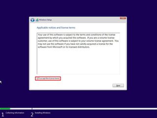
This is something I've complained about many times, but the offline, clean install UI for Windows 10 hasn't changed much since Vista. Sure, it's been flattened a bit, but it's been pretty much the same since Windows 8, meaning it's not following along with the new Windows 10 design language in use today.
Get the Windows Central Newsletter
All the latest news, reviews, and guides for Windows and Xbox diehards.
Microsoft should drop the old-school window design in favor of a more modern experience that looks similar to the out-of-box experience on Windows 10. Something simple, but using a refreshed design that leaves behind the old flattened Windows Aero design.
File Explorer and related dialogs

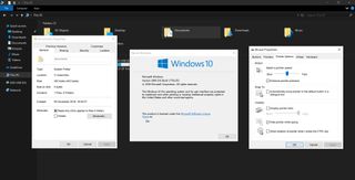
We already know File Explorer is an old bit of software. It's engraved deep within Windows' legacy roots, and as such, it can't easily be updated with anything that involves the word "modern." Still, it'd be nice if one day we did see File Explorer updated with a design that follows the rest of Windows 10.
The file properties dialog boxes use designs that span back to Windows 95. You'll find some of the oldest UI elements buried in File Explorer if you look hard enough. Control Panel is another excellent example, with several control panel applets such as cursor settings that span back decades. Microsoft is slowly moving Control Panel into the modern Settings app already, though, so we give that one a pass.
What do you think?
There are hundreds more old UIs that are still present in Windows 10, and we simply can't (or at least, won't) list them all. What old UIs are you hoping Microsoft gets around to updating next?

