Windows 11: This is the new centered Start menu and Taskbar UI
Get a closer look at the new Start menu and Taskbar UI coming in Windows 11
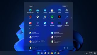
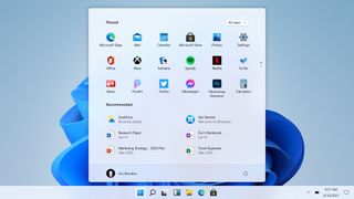
An internal build of Windows 11 has just leaked, and we've had a chance to go hands-on with the new Start menu and Taskbar interfaces that headline some of the new user experiences changes coming with Microsoft's new OS.
Starting with them most obvious change; the Start and Taskbar interfaces have moved! By default, Windows 11 features a centered Taskbar and Start menu experience, meaning the Start button itself has moved from the left-hand corner after 26 long years. Those who prefer having the Taskbar and Start menu aligned to the left can choose to do so via a toggle in the Windows Settings app.
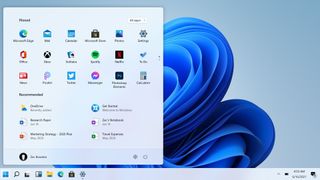
The new Taskbar is a lot more "fluid" than the old one, featuring subtle animations when clicking on app icons or the Start button. The Start button itself has been changed from the classic Windows flag to a shape that more resembles the Microsoft logo, which aligns Windows with other products at Microsoft that have slowly been adopting the Microsoft squares as their facing identity. The Taskbar itself is a little taller than the old one too, which gives the Taskbar a more modern look.
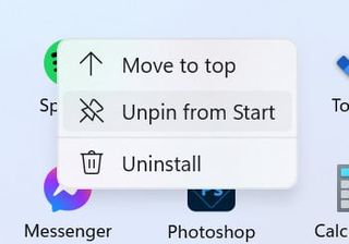
The Start menu itself has a brand-new layout that replaces the aging Live Tile interface with a customizable grid of icons. This area is called "Pinned" and features all the pinned apps that a user has decided should show up at the very top of the Start menu. You can pin as many icons as you want, but only 18 can be displayed at once. For apps that you've not pinned to the main Start page, you can find them in the dedicated "All apps" list which takes you to a familiar looking list of all your installed apps.
Below the Pinned area is a new "Recommended" area that displays your most recently opened Office documents and installed apps. This area makes it easy to jump back in to a Word document you were working on yesterday or pin a newly installed app to the top of your Start menu. This new Recommended area is a replacement for the old Timeline feature that's no longer present on Windows 11. The Recommended area will show 6 items, with a "More" button that will take you to a list of even more recent activities.
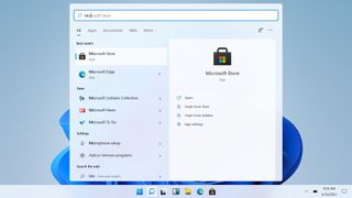
At the very bottom of the Start menu is your profile picture, name, and power controls. You can customize this bottom area with File Explorer shortcuts such as Downloads, Pictures, or even the Settings app. Search works just like it does on Windows 10, even though there isn't a visual search bar on the Taskbar anymore. Just hit Start, and begin typing, and Windows will automatically switch you to the improved Search UI.
Overall, the new Start menu is more like a launcher for your most used apps instead of a home screen. The old Live Tile interface was something that you could truly customize and make your own, but Microsoft has decided to go with a more simple, easier to manage grid of icons on Windows 11 and I think it works. I know many will miss the Live Tile interface, but I prefer the "launcher" nature of the new Windows 11 Start menu more.
Get the Windows Central Newsletter
All the latest news, reviews, and guides for Windows and Xbox diehards.


Check out our hands-on video
Screenshots not doing it justice? We have a 12-minute hands-on with this build of Windows 11, showing off all the new UI!
