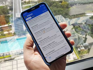
Outlook's bold redesign on iOS is now available for everyone
Outlook's bold new redesign on iOS has completed its rollout.

In December, Microsoft began rolling out a refreshed interface for the Outlook app on iOS. At the start, the new look was making its to everyone slowly, but, as of today, it's now available to everyone, Outlook's product lead Michael Palermiti announced on Twitter today.
As of today the rollout of the new @Outlook for iOS design is now available to all users! Thank you for all of the feedback, keep it coming! 💌 pic.twitter.com/r7MurYt8qDAs of today the rollout of the new @Outlook for iOS design is now available to all users! Thank you for all of the feedback, keep it coming! 💌 pic.twitter.com/r7MurYt8qD— Michael Palermiti (@MPalermiti) January 30, 2019January 30, 2019
The biggest change with the redesign is that it's now a lot more colorful. The top of the inbox is now dominated by a blue header that Microsoft designed to help you more easily identify Outlook when you're quickly switching between apps.
The updated app also integrates some sensory feedback when you're using swipe gestures in your inbox. You'll now see some "subtle" changes in color, shape, and iconography when you swipe left or right on an email. "The corners of the message transform from hard-edged to soft and round, metaphorically pulling that item away from the message list and sending it where you want it to go—with haptic feedback," Microsoft said when it revealed the redesign in December.
In the calendar portion of the app, you'll now be able to slide an event around to find a time that works for all attendees. You can also now take action on events, allowing you to do things like check in to flights directly from the app.
If you're using Outlook on iPhone or iPad, the redesign should be available for everyone now on the App Store.
Get the Windows Central Newsletter
All the latest news, reviews, and guides for Windows and Xbox diehards.
Dan Thorp-Lancaster is the former Editor-in-Chief of Windows Central. He began working with Windows Central, Android Central, and iMore as a news writer in 2014 and is obsessed with tech of all sorts. You can follow Dan on Twitter @DthorpL and Instagram @heyitsdtl.

